An air quality exposure analysis of 25 Los Angeles school bus routes revealing that students in low-income neighborhoods breathe 2.4x more polluted air on their way to school than students on other routes.
When I started this project I was thinking about where children actually spend time breathing outdoor air and school buses came to mind immediately. About 26 million students ride school buses in the United States every day and the reason this is a bigger deal than it sounds is that students sit at tailpipe height. On a school bus that means you are sitting right in what air quality researchers call the breathing zone — the layer of air where diesel exhaust, PM2.5, and NO2 are most concentrated before they disperse upward.
The thing that bothered me was that I could not find any tool that actually mapped air quality conditions along specific school bus routes at a fine enough resolution to be useful. There is plenty of research on the general problem of diesel bus emissions but nobody had built something that said here are route A and route B and here is how the exposure on those two routes compares by income level of the neighborhoods they serve. That is what I was trying to build.
| Dataset | Source | What It Contributes |
|---|---|---|
| PM2.5 & NO2 Monitoring | EPA Air Quality System (AQS) | Reference-grade pollutant concentrations at fixed monitor locations |
| Hyperlocal PM2.5 Sensors | PurpleAir (EPA correction applied) | Dense spatial coverage at intersections and corridor segments |
| Traffic Count Data | Caltrans Traffic Census Program | Vehicle volume and heavy-truck percentage by road segment |
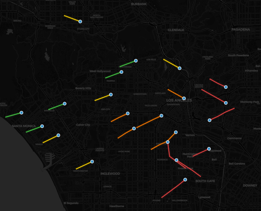
| School Bus Routes | LA Unified School District | 25 digitized route geometries with stop locations |
| School Locations | NCES Common Core of Data | School socioeconomic context (Title I status, free/reduced lunch %) |
| Census ACS 5-Year | U.S. Census Bureau | Tract-level median household income along each route corridor |
The first methodological decision I made was to sample pollution levels at 100-meter intervals along each route and the reason I chose 100 meters is because air quality changes meaningfully at that scale in an urban environment — especially near intersections, bus stops, and freeway on-ramps where vehicles idle. Larger intervals would have smoothed over the worst exposure hotspots.
I used both EPA AQS reference monitors and PurpleAir low-cost sensors but I did not just average them together. The reason PurpleAir sensors need a correction factor is because they use optical particle counting which tends to over-read PM2.5 in humid conditions. I applied the EPA correction equation published in 2021 to bring the PurpleAir readings into alignment with the reference monitors before I combined them. For each 100m segment I calculated a weighted average based on distance to the nearest sensor of each type.
I also incorporated Caltrans traffic count data and the reason for that is because the same road segment can have very different air quality at 7am versus 3pm depending on traffic volume. Morning routes run during peak congestion so vehicles sit idling at intersections longer which increases the dose a student receives per unit of distance traveled. I used the time-of-day traffic factors to weight the exposure estimate for each segment up or down based on when the route actually runs.
I combined everything into an Inhalation Exposure Index scored 0 to 100 for each route. The IEI is a weighted composite of normalized PM2.5 concentration, normalized NO2 concentration, and a traffic density factor. I weighted PM2.5 at 50%, NO2 at 35%, and traffic density at 15% and the reason PM2.5 gets the highest weight is because it has the strongest epidemiological evidence linking it to long-term respiratory and cardiovascular harm in children.
| IEI Component | Weight | Rationale |
|---|---|---|
| PM2.5 Concentration (corrected) | 50% | Strongest evidence base for pediatric respiratory harm |
| NO2 Concentration | 35% | Key diesel combustion byproduct, strong asthma trigger |
| Traffic Density Factor | 15% | Captures idling exposure at congested intersections and stops |
When I calculated IEI scores for all 25 routes and grouped them by the median household income of the neighborhoods they serve I found that routes serving tracts in the bottom income quartile had an average IEI score 2.4 times higher than routes serving the top income quartile. That gap is the central finding of the project and I think it is the most important number because it puts a specific magnitude on something that was previously just described in general terms.
When I mapped the results the highest-scoring routes were concentrated in South Los Angeles and East Los Angeles and the reason those corridors score so high is that they run along or parallel to high-volume freight routes like the I-710 and I-110 corridors where diesel truck traffic is especially heavy during morning hours when school buses are running.
What surprised me was how much the time of day mattered. I found that morning routes on the same corridor scored about 23% higher than afternoon routes on average and the reason for that is morning peak traffic is heavier and the thermal inversion layer that forms overnight traps pollutants close to the ground until the atmosphere heats up and mixes mid-morning.
When I compared the segment-level PM2.5 estimates to the EPA annual standard of 9 µg/m³ I found that 8 of the 25 routes had at least one prolonged corridor segment — meaning more than 400 meters — where the estimated concentration exceeded that standard during a typical morning run.
| Layer | Technology |
|---|---|
| Air quality data pipeline | Python — EPA AQS API, PurpleAir API, pandas for sensor fusion |
| Route segmentation | Python (Shapely, GeoPandas) — 100m interval point generation |
| Traffic weighting | Python — Caltrans CSV join, time-of-day factor application |
| Interactive map | Leaflet.js — route polylines colored by IEI score |
| Charts & summaries | Chart.js — route comparison bar charts, equity gap visualization |
| Hosting | GitHub Pages |
The biggest limitation I want to be upfront about is that I am estimating exposure from stationary sensors and not from sensors actually on the buses. The reason that matters is that air quality inside a moving vehicle can differ from the roadside measurements I used depending on vehicle speed, window position, and the bus's own engine emissions. A more rigorous study would put sensors on the buses themselves but that was outside the scope of what I could do with publicly available data.
I also want to be clear that the PurpleAir sensors I used have gaps in spatial coverage and the reason that affects the results is that some 100m segments got their pollution estimate from a sensor that was farther away than I would have liked. I tried to flag high-uncertainty segments in the data but the map does not currently communicate that uncertainty to the user visually which is something I would fix in a future version.
What I took away from building this is that the hardest part of an environmental equity analysis is not finding the disparity — it is being specific about what is causing it and how confident you are in the numbers. I felt like having a concrete index score and a concrete finding (2.4x) made the project more useful than just saying pollution is worse in lower-income neighborhoods which everyone already knows. The point was to put a number on it and show exactly where on the map it happens.